- You are here:
-
Joomla! Tutorials

-
Joomla! 3
- Getting Started
Displaying Modules/Menus on Mobile Devices
CloudBase 3 is a template based on the Gantry4 Framework, which uses Bootstrap, a responsive grid system. A useful feature of Bootstrap is the collection of responsive utility classes that can be used to help tweak layouts by providing a simple method of showing or hiding modules. Insert the support classes below into your module settings to show or hide a module for a particular device.
| Class |
Phones (<=767px) |
Tablets (768-959px) |
Desktops (960-1199px) |
Desktops (>=1200px) |
| visible-phone | Visible | Hidden | Hidden | Hidden |
| visible-tablet | Hidden | Visible | Hidden | Hidden |
| visible-desktop | Hidden | Hidden | Visible | Hidden |
| visible-large | Hidden | Hidden | Hidden | Visible |
| hidden-phone | Hidden | Visible | Visible | Visible |
| hidden-tablet | Visible | Hidden | Visible | Visible |
| hidden-desktop | Visible | Visible | Hidden | Visible |
| hidden-large | Visible | Visible | Visible | Hidden |
When creating a module, click on the Advanced tab and enter the support class in the Module Class Suffix field.
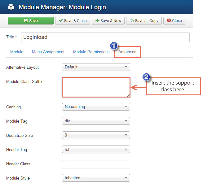
Important: If the class inserted in Module Class Suffix field doesn't take the effect, please add a space before its name.
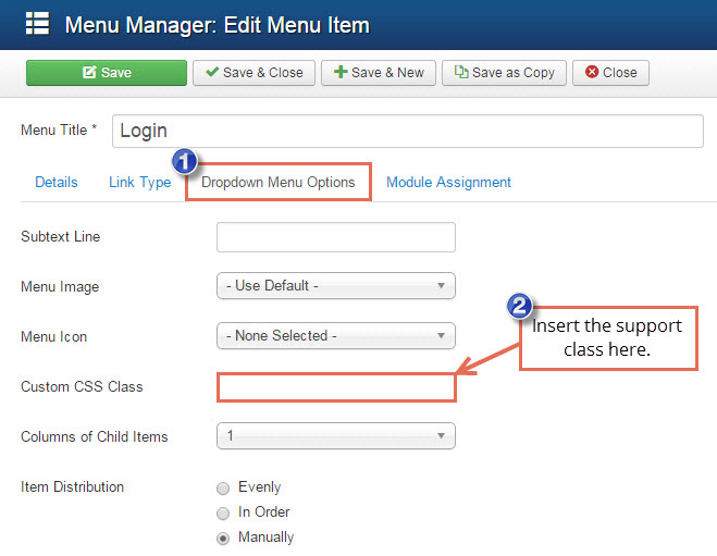
When creating a menu item, click on the Dropdown Menu Options tab and enter the support class in the Custom CSS Class field.
Knowledgebase

100% FREE
Joomla & WordPress
Hosting
- Launch Instantly
- Free Subdomain
- Free Training
- Free SSL
- 500MB Space
- 1CPU/1GB RAM
- FTP Access
- MySQL Access

Do you have suggestions for improving this article?
We take a great deal of pride in our knowledgebase and making sure that our content is complete, accurate and useable. If you have a suggestion for improving anything in this content, please let us know by filling out this form. Be sure to include the link to the article that you'd like to see improved. Thank you!