- You are here:
-
Joomla! Tutorials

-
Joomla! 3
- Getting Started
Preventing menu dropdown going off the screen
Nowadays people are more and more often browsing sites using smartphones and tablets. It is very important to keep your website viewable on all devices. Sometimes, you may need to consider float your menu dropdowns to the left, as it's shown in the screenshots (the problem may also happen on desktop devices/laptops when having deep multi-level menu).
The default setting (menu dropdowns float to the right):

Menu Items floating left:

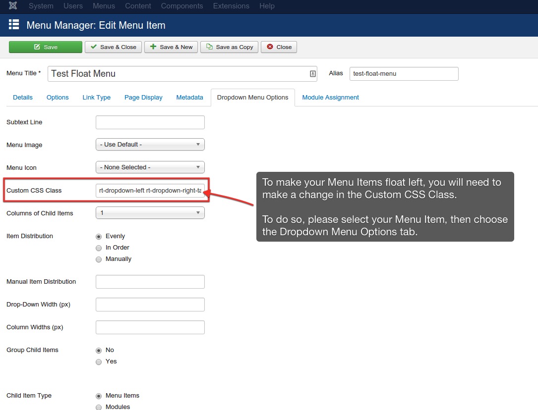
To change the menu float side, please go to Menus->menu_name->menu_item_name (dropdown's parent), choose Dropdown Menu Options tab-> Custom CSS Class. In the field please type: rt-dropdown-left. This class is applied for desktop devices/laptops. If you need to overwrite the setting for the same dropdown on tablets, type in the same field (after the space) rt-dropdown-right-tablet (see the screenshot).
Knowledgebase

100% FREE
Joomla & WordPress
Hosting
- Launch Instantly
- Free Subdomain
- Free Training
- Free SSL
- 500MB Space
- 1CPU/1GB RAM
- FTP Access
- MySQL Access

Do you have suggestions for improving this article?
We take a great deal of pride in our knowledgebase and making sure that our content is complete, accurate and useable. If you have a suggestion for improving anything in this content, please let us know by filling out this form. Be sure to include the link to the article that you'd like to see improved. Thank you!